The City of Prince George Website audit & redesign
Project Goals
Using the original website’s design language and content, create an accessible and intuitive municipal website for the City of Prince George. Furthermore, provide Municipal staff with tools and knowledge, to successfully update their website, while ensuring user experience (UX) and accessibility best practices.
Completion
Spring / Summer 2022
UX / Accessibility Audit
In order to retain the overall look and feel of the original website, we began by doing an extensive audit of the live website, with Web Accessibility of WCAG 2.0 Level AA (2022) and UX being the primary focus.
The audit included reviewing the website in it’s entirety, page by page, as well as reviewing the website in different website browsers, and screen sizes. In addition to manually reviewing the website, we also used a web accessibility Chrome extension called “WAVE Evaluation Tool”. By using this tool, we did not rely on a manual audit alone but also the tool allowed us to review possible development errors or improvements.
After the review we consolidated our findings, indicating the errors and the recommended solutions. Due to the unique project parameters (using the existing design as a starting point), we indicated which errors would be resolved by our team within the design and development phase, and which areas, such as content, would be addressed by the City.
Image of municipal website homepage during the UX and accessibility audit.
Image of UX / Accessibility Audit, showing a small portion of the full Audit. The full audit included 150+ actionable items.
Notable Accessibility Findings
The use of "Learn more" for button content is not descriptive for users or assistive technologies such as screen readers. A screen reader will read aloud and list all the links within a page, where "Learn more" does not provide any context to the link.
Colour contrast between links and regular text did not meet accessibility standards. Links should be easy for users to locate when surrounded by other elements such as paragraphs or other regular text.
Text within an image. It is difficult to ensure an appropriate contrast between text and colours within the image, while also ensuring text legibility when the image is viewed on different screen sizes, such as mobile. Text should be removed from the image and be placed within an area where legibility is guaranteed.
Notable Usability Findings
The menu and inside page side navigation did not meet user expectations. When selecting a menu item within the inside page side navigation, the selected item moves to the top, with menu items expanded. To resolve this, the menu items should retain their positioning, with menu items being sorted by order of importance.
The website lacked continuity, especially for clickable elements. A clearly refined and consistent design language for clickable elements will ensure user expectations.
Active section and page indicators were missing from within the design language. There should be visible difference from the active page and surrounding default links. This active state should also be consistent throughout all levels of the menu (parent pages and child pages).
Website Redesign
Following the UX and accessibility audit, we implemented all client approved recommendations that were applicable within the design phase. In order to meet client goals, the overall look and feel of elements that were not effected by usability or accessibility remained familiar to the existing design language. Some elements that remained similar to the original website included fonts, images sizes, homepage content rows, and the client sitemap.
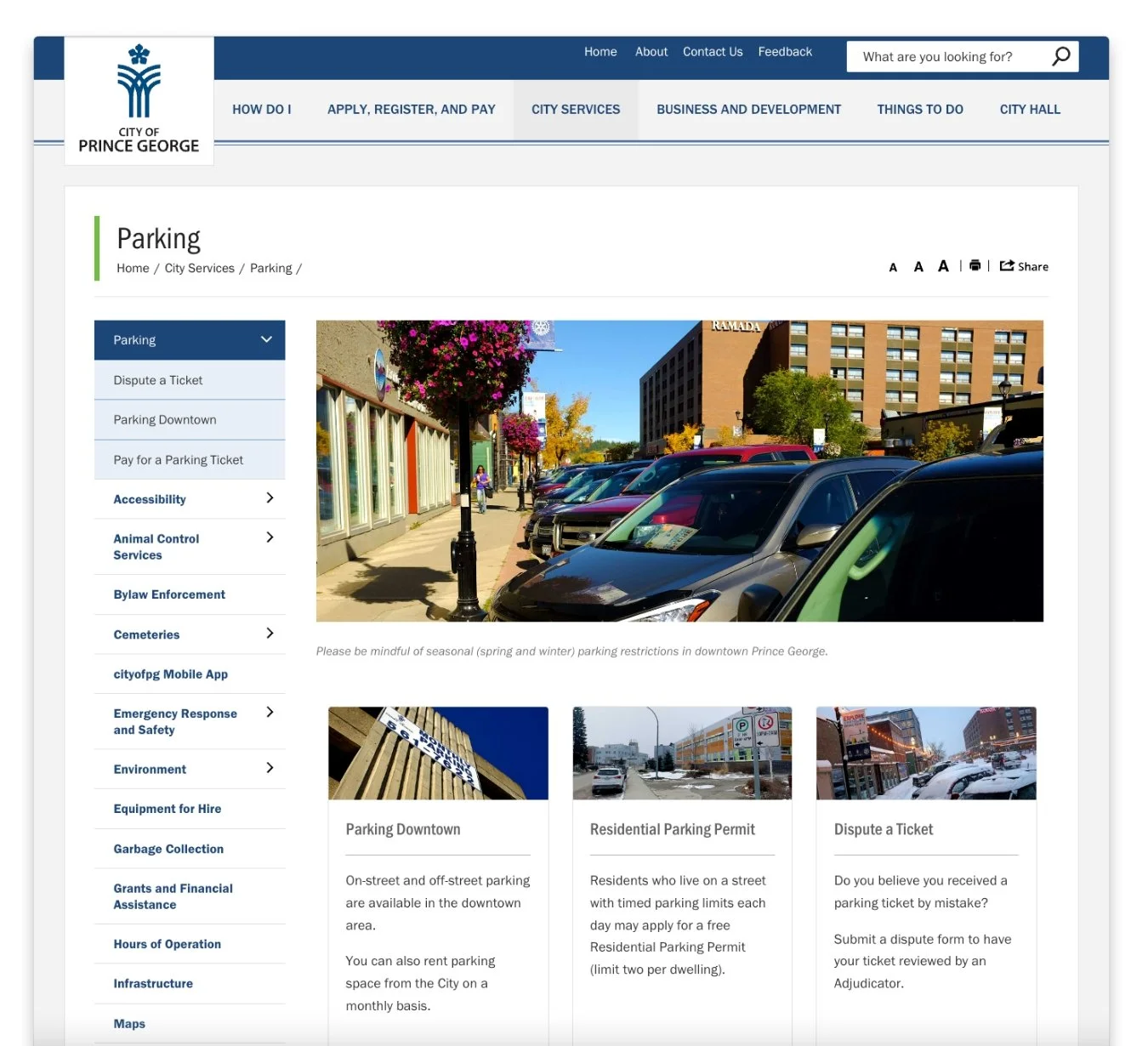
Image of municipal website before the redesign or UX / accessibility improvements.
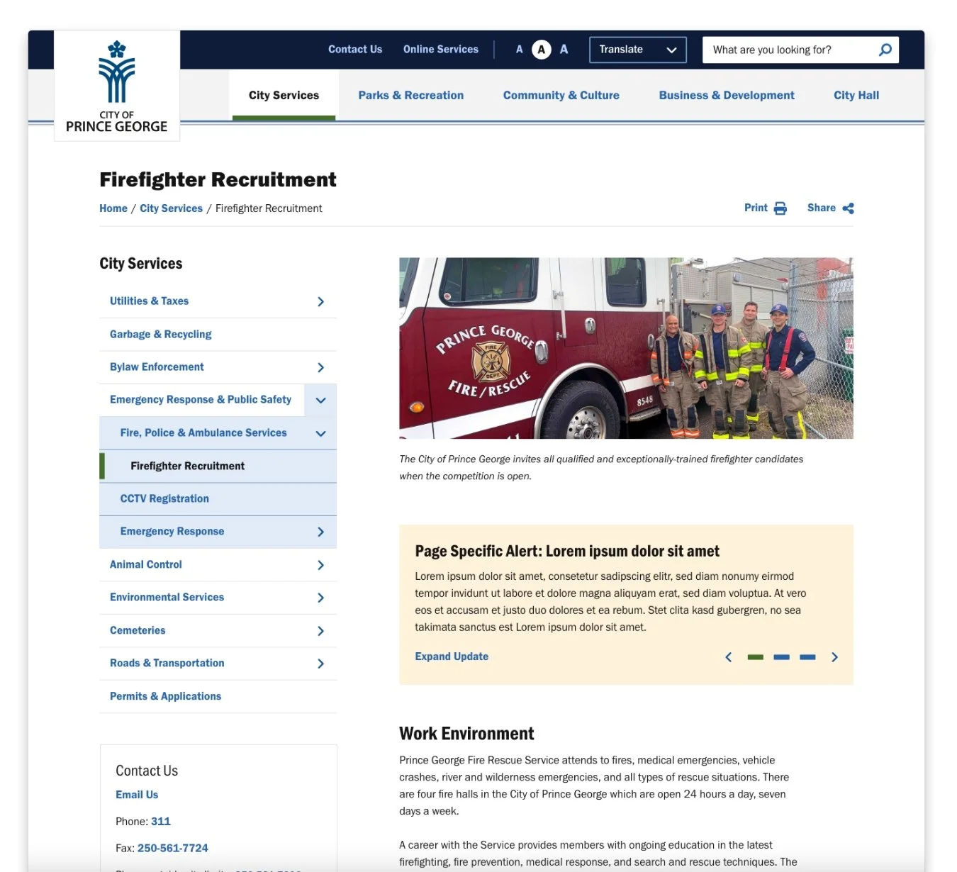
Image of municipal website after the redesign, including UX / accessibility improvements.
Development & Content Guide
After competition and approval of the of the website redesign, the project moved into the development phase, where the development team continued to work from the UX and accessibility audit. In this phase we addressed elements such as clear focus states, removal of reordering menu items within the inside page navigation, removal of an auto timer within the banner carousel and consistent default, hover and active states for links and buttons.
In addition to, within this phase we provided the client with a content guide that included best practices for maintaining an easy to use and accessible website.
Notable Content Guide Recommendations
Avoiding the use of all capitals. This can be problematic for legibility and in some cases screen readers. Screen readers may read out loud each letter rather than the entirety of the word.
Ideal usage for images and text. In cases where text within an image cannot be avoided, appropriate and descriptive alt text should be included.
Avoiding the use of “learn more” or “read more”. Links and buttons should be descriptive for users so they can locate information they are looking for.
Final Interface & Project Success
Users are left with an ideal user experience, as well the client was left with the knowledge to maintain a usable and accessible municipal website.
This project was valued high by the City and was deemed a great success. After the successful launch of the City website, the client reached out to continue working with us and improving their website. Since the completion of the main City website, we have taken on three new projects with similar unique parameters, with myself as the lead designer.
Brand Update 2024 / 2025
The City of Prince George underwent a brand refresh, and we partnered with the client to integrate these updates into the final interface. The design updates included new fonts, colours, graphic elements, and curved shapes and visuals. These changes were implemented using the existing interface as a foundation, while preserving the UX and accessibility improvements made in 2022.
The City of Prince George website with brand updates.


